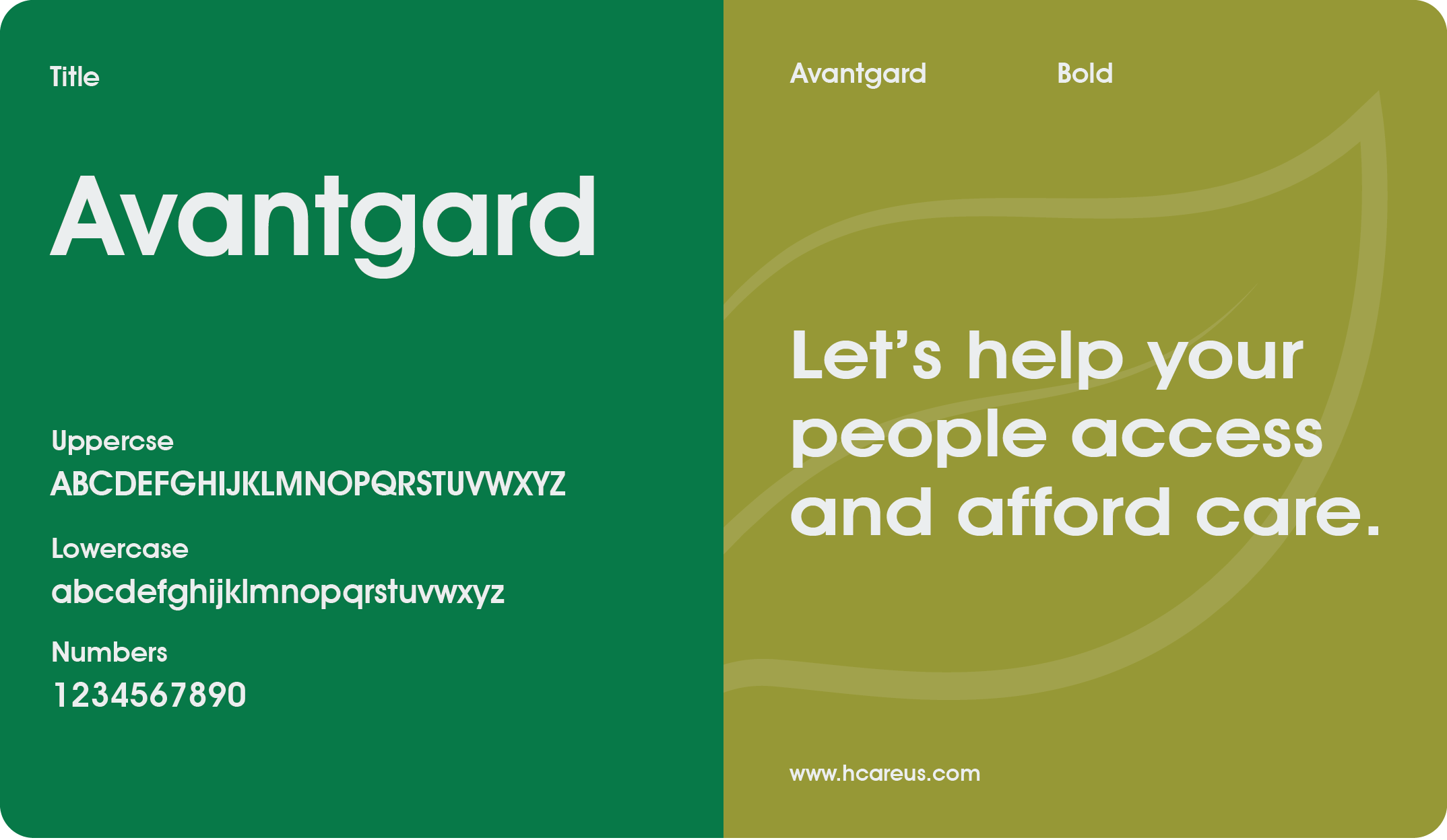

H-Care is a progressive force within the context of the healthcare sphere. It provides its members with a complete health management package through which they can receive individualized health plans, access doctors at any time, and track the progress of their health objectives. These are their primary objectives – to support individuals in regulating your health as conveniently as possible without intermediaries in medicine.
This logo icon is based on the energy and compassion heartbeat symbol presented on the previous logo. The selected colors all promote a feeling of trust and wellbeing which is in line with H-Care vision on delivering affordable medical services that put the patient first. It is symbolical yet profound – capturing their mission in a nutshell: to improve the overall accessibility and interconnectedness of managing health.
Writing this work was not only about branding it but also about actively contributing to the further progress of the mission, which has a positive impact on people’s lives. Health is a fundamental human right and H-Care has a noble vision of ensuring that it becomes easy, useful and liberating for those who require it.
2024
Healthcare
Logo
Brand Identity
Digital Platform


That is why it is time to create a brand that will become a tradition.
Your journey starts now.

Transforming concepts into compelling visuals is our passion. At ETGraphics, we deliver creative design solutions that elevate your brand and engage your customers.